
Topic Type:
Idea
Some ideas about how we might improve the structure of the tools pages without loosing flexibility and ease of use.

Join the conversation! The forum activity is now at GOATeach.org! (link is external) We are working to cross pollinate our conversations. Document and share tools at farm hack and talk at GOAT! Also join GOAT riot (link is external) and introduce yourself and your projects!
Some ideas about how we might improve the structure of the tools pages without loosing flexibility and ease of use.
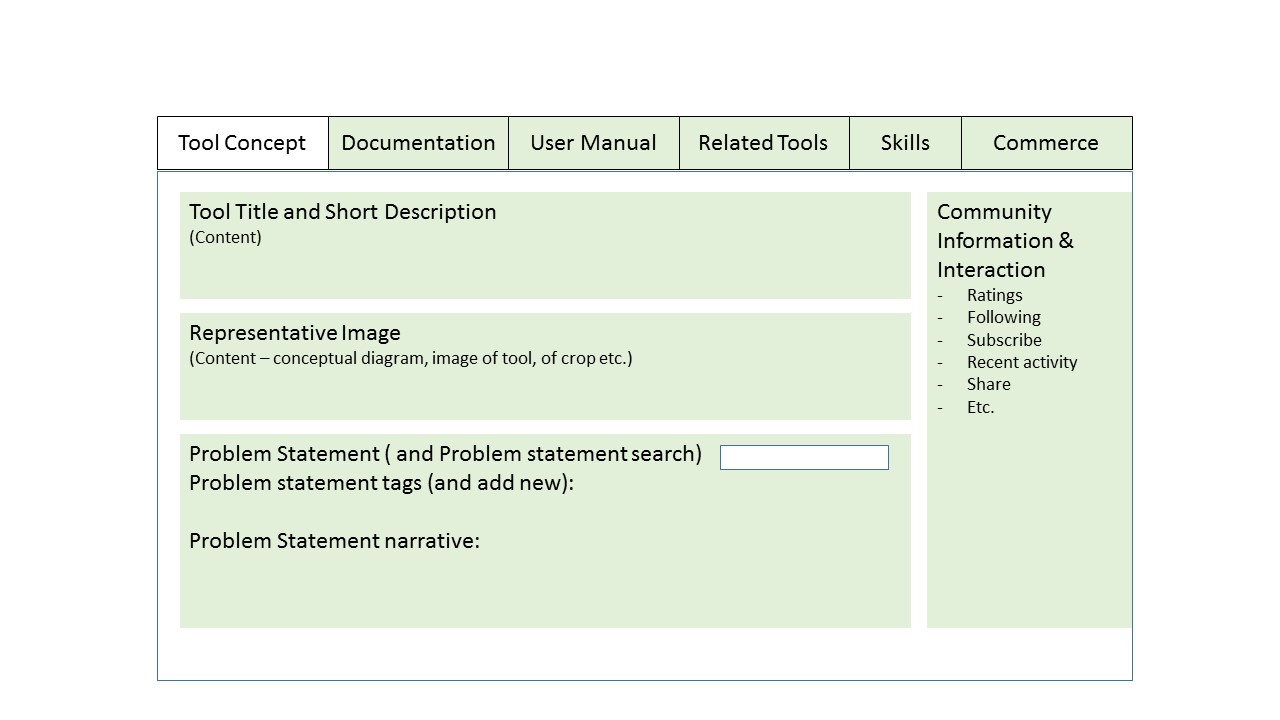
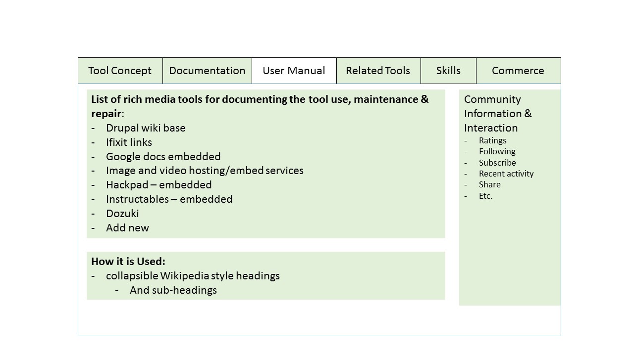
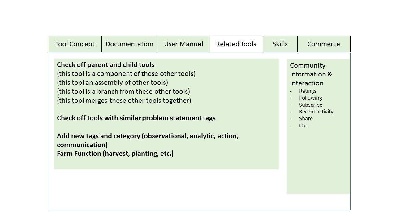
One possible way to organize "Related Tools" is as wiki-style, in-text links within the "Documentation" category. This may render the "Related Tools" redundant as it is conceptualized here.
However, I could also see a role for a graphic interface in the related tools section. This interface would show a web of relationships between tools, forums, people, skills, and commerce. Don't know if it's worthwhile to build something like this but it seems that if we are going to show Related Tools outside of Documentation, we may want to do it in a visual way.
Looks like a real improvement. I love the Farm Hack concept, but I feel like there is bit of confusion on how to use this website. I would think an improved navigation experience and some explanatory text about wiki and how to use this site would be a more pressing concern in terms of gathering more users and audience. For instance, I don't need all the subscription widgets on the right column on this page. Also, why have the +newtopic button up on the top there? Why would I do that right now while looking at a topic? And I don't need the Google analytics counter either, it is just extra data I don't have the need for. It all feels a bit frantic in the right column.
Improving the user experience of the site is emerging from our Organizers Calls (link is external) and web development conversations as a high priority. All are welcome to join in the collaborative development and brainstorming processes at any time.
We have a developer working on a usability study for the site at the moment. The outcome will be more helpful feedback like what you're providing here. It will ultimately result in the FH site being easier to use and more accessible.
We're also talking about automating "Welcome" messages when users register and when they make their first post. These would users the documentation and usability guidance which should be more apparent.
We do have documentation guidance in the Tool Template (link is external) but it may not be that accessible. The getting started (link is external) page at the top of the home screen may help with that but perhaps it needs to be made more readily available and interactive.
Thanks again for the comments.
Improve by collaboration, grow by participation